Kitchen Paint Colors With Golden Oak Cabinets: Harmonizing Warmth and Style
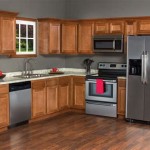
Golden oak cabinets, a staple in many homes built in past decades, present a unique design challenge when updating a kitchen's aesthetic. Their warm, honeyed tones can sometimes appear dated when paired with the wrong paint colors. Selecting the right paint is crucial to achieving a balanced, modern, and inviting kitchen space that celebrates the existing cabinetry while injecting fresh personality.
The inherent warmth of golden oak dictates a careful consideration of color temperature and undertones when choosing a complementary paint hue. Understanding the nuances of color theory, the impact of lighting, and the textural qualities of various paint finishes are all essential for a successful kitchen renovation. This article explores several paint color families that harmonize well with golden oak cabinets, providing insights into how to create a cohesive and stylish kitchen environment, minimizing the perceived "golden" hue and maximizing a sense of modern sophistication.
Understanding the Undertones of Golden Oak and Paint Colors
Golden oak, as the name suggests, possesses a distinct yellow-orange undertone. This inherent warmth needs to be accounted for when selecting a coordinating paint color. Ignoring this undertone can lead to clashing hues, resulting in a visually jarring and unappealing space. Therefore, a foundational understanding of color theory and how colors interact is paramount. Utilizing a color wheel helps visualize complementary, analogous, and contrasting colors, and is a valuable tool during the selection process.
When working with golden oak, potential paint colors should be evaluated in the actual kitchen environment, considering both natural and artificial light. Light significantly impacts how colors are perceived. A color that appears cool and calming in a paint store might appear drastically different under warm kitchen lighting. Samples should be painted on large boards and observed at various times of the day to accurately assess their interaction with the golden oak cabinets and the existing lighting conditions.
Furthermore, the sheen of the paint plays a role in the overall aesthetic. Matte finishes absorb light and create a softer, more muted look. Semi-gloss or gloss finishes reflect light, which can enhance brightness and highlight details. A subtle sheen, such as eggshell or satin, is often recommended for kitchen walls, offering a balance between durability and visual appeal. It is also critical to consider the undertones of the paint beyond its primary hue. For instance, a "white" paint can have cool (blue, gray) or warm (yellow, beige) undertones, which will dramatically affect its compatibility with the golden oak.
Paint Color Families That Complement Golden Oak
Several paint color families can successfully complement golden oak cabinets, each offering a unique aesthetic and sense of style. These families include cool neutrals, warm whites, muted greens and blues, and even carefully selected grays. The key lies in selecting shades within these families that either contrast with or subtly harmonize with the cabinets' warm undertones.
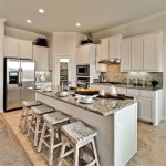
Cool Neutrals: These colors provide a refreshing contrast to the warmth of the golden oak. Soft grays with a hint of green or blue can effectively neutralize the yellow-orange tones, creating a more balanced and contemporary look. Greige, a blend of gray and beige, can also be a suitable option, offering a warmer neutral alternative to pure gray. The specific shade of gray or greige should be carefully chosen to avoid appearing too cold or stark against the golden oak. Using warmer toned accents such as brass hardware to tie the color palette together can bring a room together. Lighter shades within these families tend to work best, as darker grays can create a heavy and potentially dated feel.
Warm Whites: Though seemingly a simple choice, selecting the right warm white is crucial. Off-whites with subtle yellow or cream undertones create a cohesive and inviting atmosphere. These shades soften the overall look and prevent the kitchen from feeling sterile. It's imperative to avoid stark, bright whites, as they can accentuate the yellowish tones of the golden oak and create an undesirable contrast. The warm white selected should have a similar undertone to the golden oak to create a visual harmony.
Muted Greens and Blues: These colors offer a touch of personality while remaining complementary to the golden oak. Soft, muted greens, such as sage or seafoam, can create a soothing and natural atmosphere. Similarly, pale blues with gray undertones can provide a calming and sophisticated touch. The key is to avoid overly bright or vibrant shades, as these can clash with the warmth of the cabinets. Muted tones allow the golden oak to remain a focal point while adding a refreshing visual element.
Strategic Use of Gray: Gray can work well if carefully selected. To avoid a cool, sterile look, opt for grays with warm undertones like beige or taupe. These "greige" tones bridge the gap between gray and beige, creating a more harmonious blend with the golden oak. Alternatively, consider using gray as an accent color on an island or a single wall, pairing it with a warmer neutral on the remaining walls. This approach adds depth and interest without overwhelming the space. A common mistake is selecting a cool-toned gray, which can make the golden oak appear even more yellow and dated. Before committing to a gray paint, thoroughly test the color in the kitchen along with different lighting to see how it interacts with the cabinets.
Beyond Paint Color: Complementary Design Elements
Achieving a cohesive kitchen design involves more than just choosing the right paint color. Carefully selecting complementary design elements, such as hardware, countertops, backsplash materials, and lighting fixtures, is essential for creating a unified and stylish space. These elements work together to enhance the overall aesthetic and minimize any perceived drawbacks of the golden oak cabinetry.
Hardware Selection: Updating the hardware on the golden oak cabinets can significantly modernize their appearance. Brushed nickel, stainless steel, or oil-rubbed bronze hardware provides a sleek and contemporary contrast to the traditional golden oak. Consider the style of the hardware, opting for simple and clean designs that complement the overall aesthetic of the kitchen. The hardware should be cohesive with the other metal fixtures in the kitchen, such as the faucet and lighting. Warmer metal tones like brass or copper can also complement the warm wood tones of the cabinets. Ultimately, the selected hardware should provide a visual upgrade, making the cabinets feel fresh and updated.
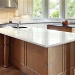
Countertop Choices: The countertop material and color play a significant role in the overall kitchen design. Lighter countertops, such as quartz or granite in shades of white, cream, or light gray, can brighten the space and provide a visual contrast to the golden oak. Avoid countertops with strong yellow or orange undertones, as these can amplify the warmth of the cabinets and create a monotonous look. Darker countertops, such as black or dark gray, can also work well, creating a dramatic contrast and grounding the space. The choice depends on the desired aesthetic and the amount of natural light available in the kitchen. Remember to select a countertop material that is durable, easy to maintain, and complements the overall color scheme.
Backsplash Materials: A well-chosen backsplash can tie the entire kitchen design together. Subway tile in a classic white or off-white shade is a timeless and versatile option that complements golden oak cabinets. Alternatively, consider using a glass tile backsplash in a muted green or blue tone to add a touch of color and visual interest. Avoid backsplashes with busy patterns or strong colors that can compete with the cabinets. The backsplash should be cohesive with the countertops and paint color, creating a harmonious and visually appealing space.
Lighting: Implementing appropriate lighting is crucial for highlighting the best features of the kitchen and minimizing any perceived flaws. Under-cabinet lighting can illuminate the countertops and backsplash, creating a brighter and more functional workspace. Pendant lights above the island or sink can add a touch of style and provide task lighting. Ensure that the lighting fixtures complement the overall design aesthetic and provide adequate illumination for the entire kitchen. Consider using LED bulbs in a warm white color temperature to create a welcoming and inviting atmosphere. The right lighting can transform a dated kitchen into a bright, modern space.

Paint Colors To Go With Honey Oak Trim Cabinets West Magnolia Charm

11 Most Fabulous Kitchen Paint Colors With Oak Cabinets Combinations You Must Know Honey Eclectic Modern

What Kitchen Color Schemes Work With Oak Cabinets The Homes I Have Made

Color Palette To Go With Oak Kitchen Cabinet Line For Those Colors Paint Living Room

The Best Kitchen Paint Colors With Honey Oak Cabinets And Trim Lantern Lane Designs

Wall Colors For Honey Oak Cabinets Kitchen Paint

Wall Colors For Honey Oak Cabinets Paint Kitchen Walls Color

9 The Best Paint Colors That Go With Oak Cabinets Archute

Paint Colors That Go Best With Honey Oak Jenna Kate At Home

Paint Colors That Go With Oak Cabinets Julie Blanner
Related Posts